
Statistical publication

Quarterly superannuation performance statistics highlights - June 2026

Superannuation
Published
31 August 2026

Key statistics

-June 2025June 2026Year-on-year change
Total superannuation assets ($bn)4,353.94,767.2+9.5%
Total APRA-regulated assets ($bn)3,047.43,411.5+11.9%
Total self-managed super fund assets ($bn)1,068.71,107.2+3.6%
Exempt public sector superannuation schemes assets ($bn)117.8187.8+5.6%
Balance of life office statutory fund assets ($bn)60.060.7+1.2%

Entities with more than six members

 June 2025June 2026Year-on-year change
Total contributions ($bn)209.5236.3+12.8%
Total benefit payments ($bn) of which:132.2148.2+12.1%
Lump sum benefit payments ($bn)73.082.5+13.0%
Pension payments ($bn)59.265.7+11.0%
Net contribution flows* ($bn)70.977.7+9.6%
Annual Rate of Return (%)10.18.6-1.5%
Five-year annualised Rate of Return (%)7.96.3-1.6%

*Net contribution flows comprise of contributions plus net benefit transfers, less benefit payments

Chart 1: Assets of superannuation entities
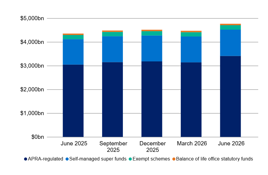
Bar chart showing projected fund values from June 2025 to June 2026 across four categories: APRA-regulated, self-managed super funds, exempt schemes, and balance of life office statutory funds. APRA-regulated funds dominate with steady growth, self-managed super funds remain stable, while exempt schemes and balance of life office statutory funds contribute minimal amounts.

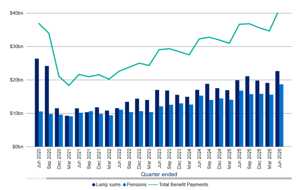
Chart 2: Benefit Payments

Bar chart with line graph showing lump sums, pensions, and total benefit payments from June 2020 to June 2026 by quarter ended. Lump sums and pensions are represented by dark and light blue bars respectively, while total benefit payments are shown as a green line, highlighting a decline in total payments in early 2021 followed by a steady increase reaching nearly $40 billion by mid-2026.

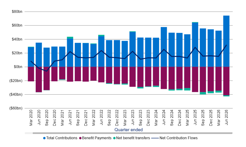
Chart 3: Net contribution flows

Bar chart displaying quarterly total contributions, benefit payments, net benefit transfers, and net contribution flows from March 2020 to June 2026. Blue bars represent total contributions increasing over time, maroon bars show growing benefit payments, teal bars indicate small net benefit transfers, and a black line tracks net contribution flows rising notably after 2024.

Chart 4: Five-year annualised rate of return
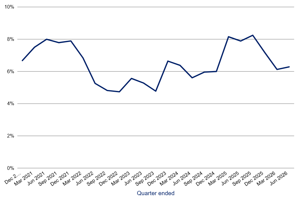
Line graph showing percentage values over time from December 2021 to June 2026, with data points fluctuating between 4% and 8%. The x-axis represents quarter-end dates, and the y-axis shows percentages from 0% to 10%, highlighting notable peaks around mid-2021, early 2025, and a dip in mid-2022.

Footnotes